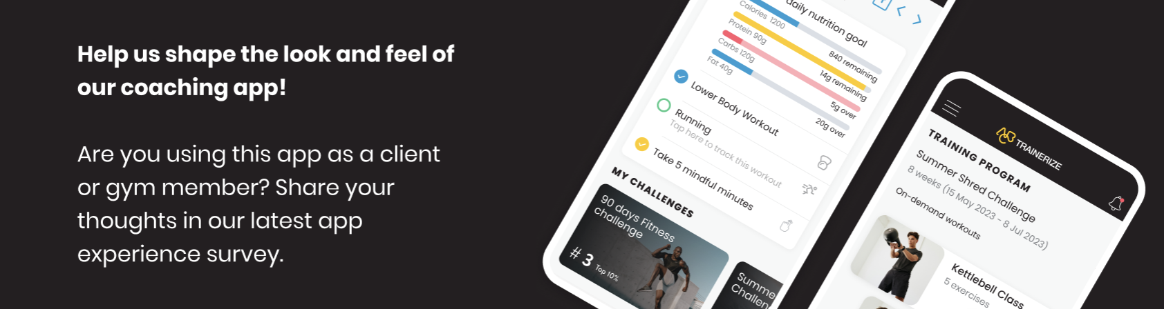
Client / Gym Members - ABC Trainerize
381 results found
-
1 vote
-
The Art of Curves: Exploring the Next Generation of Digital Beauty
In the rapidly evolving landscape of digital interaction and artificial intelligence, the boundaries of creativity and personalization are constantly being pushed. Users are no longer satisfied with static, one-size-fits-all avatars; they demand realism, interactivity, and the ability to shape their digital companions to match their exact preferences. This shift has given rise to specialized platforms that cater to specific aesthetic interests with unprecedented detail. For those who appreciate voluptuous silhouettes and bold proportions, the new frontier of AI generation offers a stunning array of possibilities. You can explore this cutting-edge technology directly at https://lovescape.com/categories/big_ass where the fusion of advanced neural…
1 vote -
Current day in week slider at top of screen should be centered not first.
As we don't have any back or forward day button, the day of week slider at top of home screen shouldn't automatically slide left and place the current day as the furthest left- it should be in spot 3 or 4 so it's a single click for previous days. This is used daily to select a day from earlier in the week to select a meal to copy to today. We now need to swipe on the mini-calendar to access just yesterday.
1 vote -
1 vote
-
New layout for Dec 25 update
Please make it possible to rearrange and expand or contract each section I don’t want to have to scroll to see the days workouts. Water and food need to be able to be hidden or put at the bottom.
2 votes -
Have the ability to enlarge type on the app
Have the ability to enlarge text/type on the app. I have my phone settings set to the largest display size and largest font, and I still cannot read some of the text on your app, such as my daily goal calories and protein, and the servings sizes in the list of foods. Thank you.
1 vote -
Tracking on the computer vs the app sometimes.
I would like to be able to input some things on the computer, like meals.
3 votes -
Food Tracking Sync with Android Health Connect so it's all in one app
Health Connect already tracks and syncs with Biolayne, food Tracking through Health Connect would allow us to use one less app and condense more health data into one place for analytics.
1 vote -
Notifications, Meal tracking and Progression
• Please make notifications about other members’ activity in the selected group optional, so users can choose not to display them within the group. This would make it much easier to follow questions and answers without distraction.
• In the food logging section:
• There should be a field to manually enter the time of consumption.
• The default image should not be automatically assigned. It should be optional and selectable by the user.
• The meal type should not be automatically set based on the time of day. Users should be able to manually select the meal type immediately,…1 vote -
Better QA testing
Your new release has introduced more bugs. When trying to add an activity now I have to do it three or four times. Better QA testing would avoid this type of error
2 votes -
Bug report - new app didnt save my workout
- Add an easy method to report bugs, not everything is a feature. I agree with the precious poster that ideally the bug report doesn't involve signing up for a forum. You already have our details via the app and we're paying members. Also why is there no category for bug report here???
- Now on to the actual bug report I started a new workout, logged it etc and the app took forever trying to save it, then it seemed to glitch and my workout disappeared. Seems like it could be an issue with the new app.
2 votes -
I wish I had a calendar to easily track gym dates, and a timer for total workout time
I wish I had a calendar to easily track gym dates, and a timer for total workout time
3 votes -
High-Risk Slots vs. Steady Gameplay: How to Spot the Difference Early
High-Risk Slots vs. Steady Gameplay: How to Spot the Difference Early
Anyone who spends enough time with online slots eventually notices a pattern: some games feel calm, predictable, and almost meditative, while others seem volatile, tense, and capable of flipping the session upside down in a single spin. This contrast is usually described as the difference between high-risk slots and games with steady gameplay. Understanding which is which early on can save both money and frustration, and it can also help players choose experiences that actually match their mood and goals.
The key is learning how to read a slot…
1 vote -
Actualizar plataforma
Crear área de AJUSTES en la app esto para colocar traductor o ajustar el idiomas y no que solo este en inglés, además de un MODO OSCURO
1 vote -
1 vote
-
Add a feature that tracks calories burned better.
The app needs to track calories burned for your workouts and for the cardio you input.
1 vote -
Calling All ABC Trainerize Users – Share Your Ideas!
Share & Vote on Ideas – ABC Trainerize
We’re constantly improving your fitness app, and your feedback drives the updates. Add a new idea or vote on existing ones to make sure your voice is heard.
Why vote?
Voting helps us prioritize features that matter most to the community. You’ll also get notifications when the status of your ideas changes.How ideas are chosen:
Votes matter, but we also consider feasibility, user feedback, surveys, and how each idea fits our platform’s vision.Your input shapes the app—submit or vote today!
Visit us: https://www.cantorlaurastein.com/about
1 vote -
Nutra check for bringing saved meals across
I know you have the in app meal planner and tracker but for someone who has invested over 2 years worth of meals and recipes into nutra check the option of starting over with this app is making me rethink my membership. It’s not worth it to restart when I have all these saved options already. Plus the nutra check app is way more user friendly
4 votes -
More one to ones with trainer
Have additional one to ones with trainer. And a way for your trainer to be with you during a workout so be sure you’re doing the exercises right. If your local to your trainer the ability to see them in person.
1 vote -
Bugs in the app
Maybe fix your **** app, I can't even check in
2 votes
- Don't see your idea?