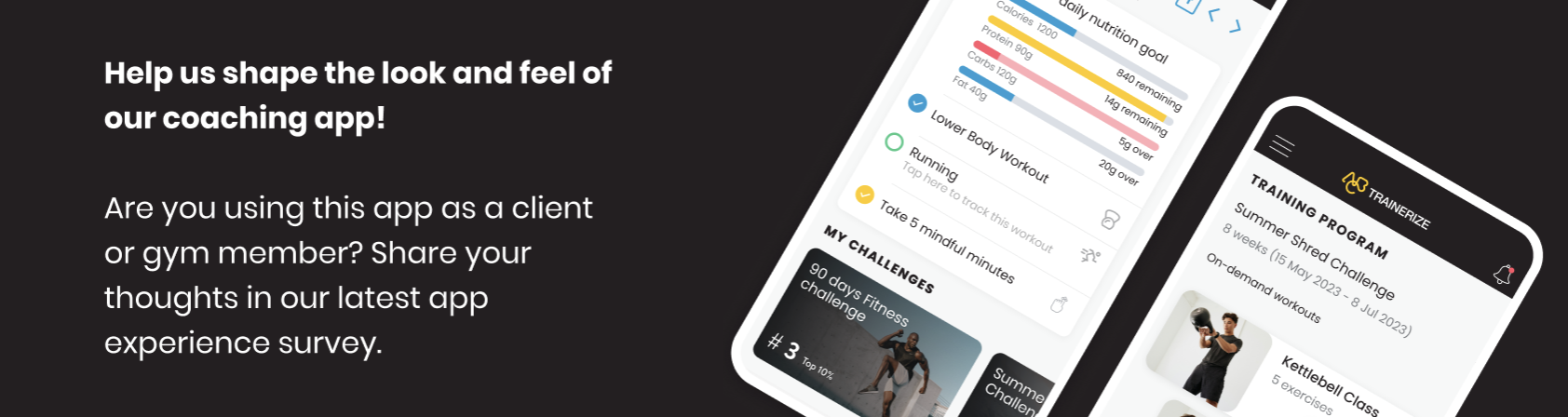
Client / Gym Members - ABC Trainerize
381 results found
-
Include precise navigation guidance. Use bullet points in sequential format on where to start and prompts for adding information
Navigating the application
Eliminate the password/initiate sending a code for authentication.1 vote -
Physical Therapy
Enter a new market by building out various physical therapy exercises, and linking into the medical field. By tapping into this area you can partner with various insurance providers, and physical therapist offices to allow for a more comprehensive engagement to individuals who need physical therapy.
1 vote -
why am I coming in second place when ive done all the days
clear up glitches, feels defeating when doing all
the day1 vote -
Merci d’ajouter la langue française, s’il vous plaît.
Merci d’ajouter la langue française, s’il vous plaît.
2 votes -
social media shareables
videos and photos for socail media that we can access to show how the app works for potential clients.
would be great if we had the option to put our own branding on too.
helping to show potential clients the amazing app and benefits1 vote -
Add Protein Powder to Exclusions selection for recipes
In the meals section under ‘exclusions’ add Protein Powder as for medical reasons some people can’t have it. We could then select it and it would automatically exclude recipes containing protein powder
1 vote -
Continually crashes on iOS
Crashes multiple times throughout a workout session. Annoying af. I would leave this app if it wasn’t attached to my trainer.
1 vote -
Fonts
The light blue and orange fonts are hard to see, they look good but for anyone with any vision issues the lighter fonts are not user friendly.
6 votes -
Navigation Quick Guide
Some of the app features are “buried” and difficult to find when you first start using the app. A quick “walk through” when first time using the app would be super helpful.
1 vote -
Darker or larger font. When at the gym, it is sometimes difficult to read without readera
See above. It is just too light. All my other fonts on phone are fine. It’s just this app
12 votes -
White button
Hello. Can you change the color of buttons? For the moment are white and i cant see anything. Can you make ithem black?
2 votes -
I would like a “my progress” scale to measure Strength gains (increase in weights)
I would like the option to see my strength gains (or losses) on a scale (I.e. squat, bench, and deadlift). It’s a helpful measurement to assess if my bodybuilding cut is too aggressive or if I need to plan a deload or refers, etc.
1 vote -
Large font option
It would be nice if the exercise tracking sections, and maybe all sections, have the option for larger print. I would love to be able to use this app without my reading glasses.
12 votes -
Emergency contact
Having an easily update friendly emergency contact section is a necessity. Especially necessary when considering the intensity of a workout & the potential for people to overexert themselves or injured themselves.
The accessibility required for the gym in case of emergency is undeniably necessary.
1 vote -
Create a seperate app for a coach
There is a seperate app for a coach to use to communicate with the client so that we don’t have to log in and out when we use the app as a client as well. And having it more user friendly
1 vote -
App is a little clunky feels more like a browser than an app
The app needs to feel more like an app. Larger buttons more user friendly. It needs an overhaul. For example clicking the small fields to complete set and weight details is clunky and clicking “next” in the middle of a workout doesn’t move the view down to the next set. It’s all just a little off and needs to be modernised. Feels a lot like a web browser, less like an app. And when people are paying for it it shouldn’t be like this. The strong app is free and feels and responds like an app
1 vote -
2 votes
-
Compatibility with the chronometer app.
The MyFitnessPal compatibility is great but for me and others we like to use the chronometer app.
12 votes -
1 vote
-
App top menu opacity
Fix the opaque white menu at the top of the app that obscures the buttons and clock up there. Please! Thanks...
3 votes
- Don't see your idea?